Telling compelling stories with Data
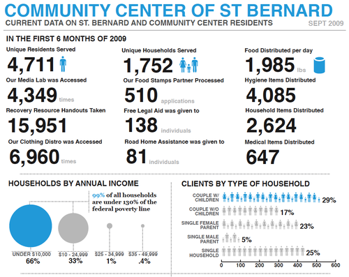
I am blown away by the data visualizations created by VISTA Billy Brown serving at the Community Center of St. Bernard. The image above is part of a data report that his supervisor found so compelling she took it to a funder.
As a grantwriter, I have to balance storytelling with data. Usually, this means mixing anecdotes with statistics: a quote here, a pie chart there. What comes out is compelling but disjointed.
By creating a beautiful, accessible, yet information rich series of charts and visuals, this graphic tells a powerful story with data.
A picture can tell a 1000 words; it can also tell a 1000 numbers…. and amazingly have them make sense.
Comments
Post new comment